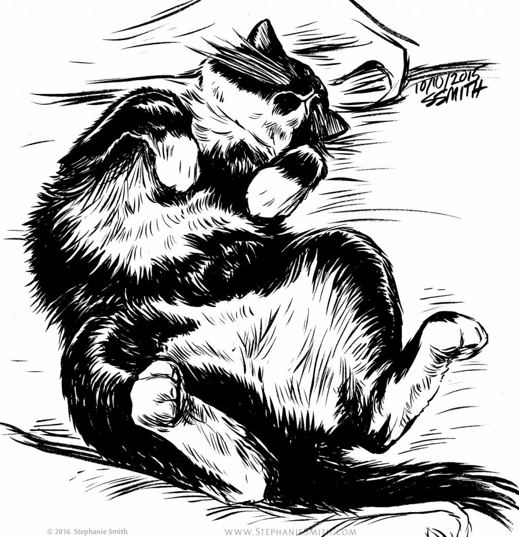
My own cats, Tinkerbell the tiny tabby and Simon the tuxedo tomcat, are frequent models. These selected ink drawings from my sketchbook are from 2016-2018.
My own cats, Tinkerbell the tiny tabby and Simon the tuxedo tomcat, are frequent models. These selected ink drawings from my sketchbook are from 2016-2018.
Accepted into the ICON9 group art show, Tall Tales, in 2016
This piece was drawing with an inkbrush but “painted” entirely digitally.
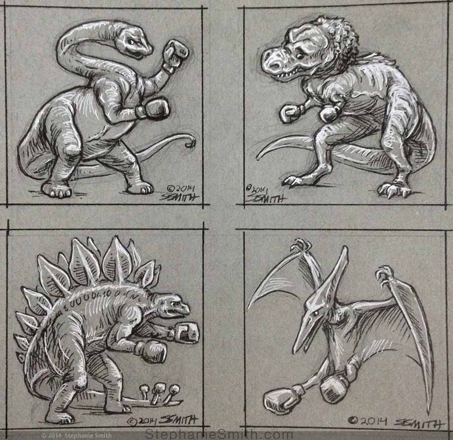
Sketch based on an art challenge from Von Glitchka titled “Boxing Dinosaurs” — it was meant to indicate the need to fit these different type of dinosaurs into a square box, but I’d already misinterpreted it to mean something VERY different…
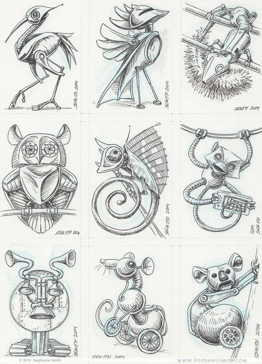
Sketches of robot animals for a themed Artist Trading Card project. Each card is 2.5 x 5 inches.
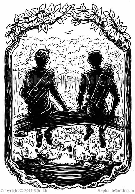
Cover Illustration for the short fantasy story, “Why,” written by Maggie Allen for author Janine Spendlove and published by the creator-run Silence in the Library Publishing as part of a Kickstarter backer bonus. The story is a bittersweet character study that takes place in Spendlove’s “War of the Seasons” fantasy universe. I worked with both Maggie and Janine to make sure I captured the style and spirit of the characters and setting.
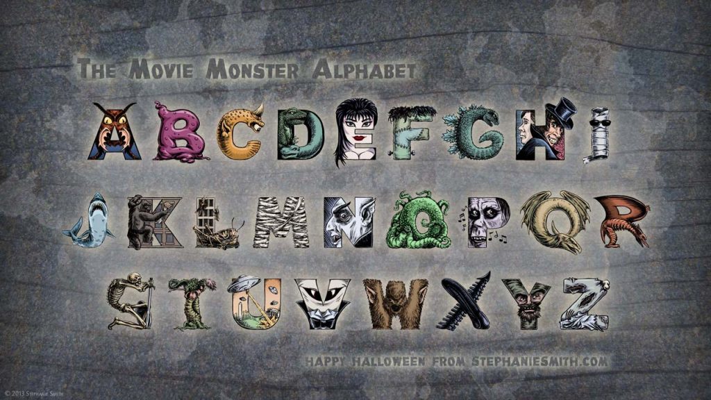
An alphabet of hand-illustrated letters in which each letter depicts a different classic movie monster whose name begins with that letter. Can you name them all?
Available for sale as a poster and other items in my RedBubble store – Buy it now!
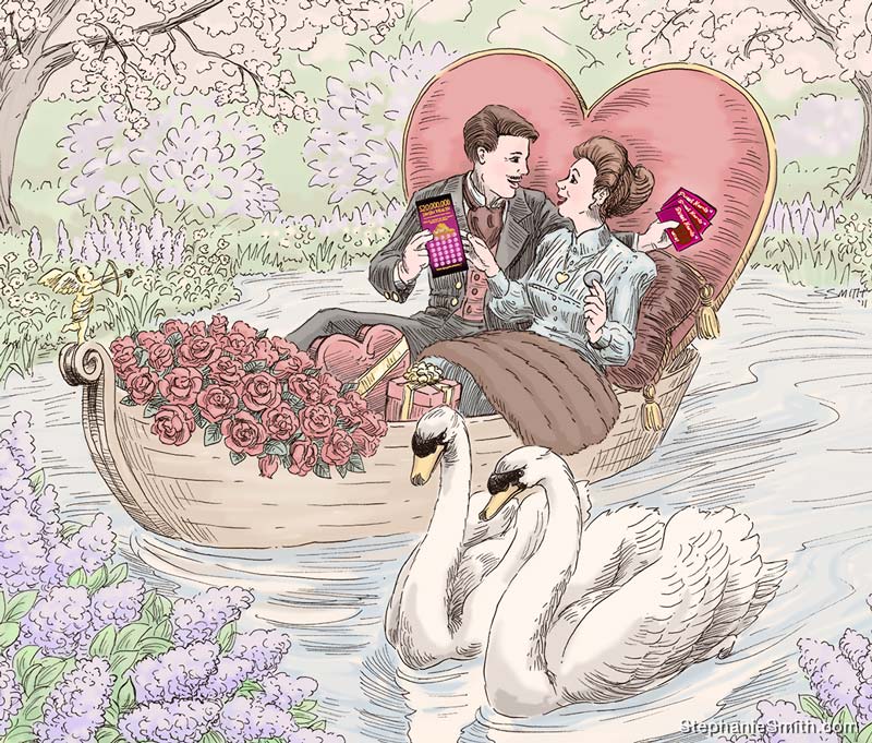
The Colorado State Lottery needed a series of period-style illustrations integrating the fun of scratch-off tickets into classic depictions of holiday celebrations for a campaign with the tagline “Celebrate… like they have for generations.” Client needed art that looked antique, reminiscent of engravings from the 19th or early 20th century, to evoke the traditional roots of each holiday.
This animated video and accompanying comic book explained the fundamental concepts of infrared astronomy to be studied by the James Webb Space Telescope.
I was involved in nearly all aspects of this project, from collaborating on the initial script outlines and storyboards to animation to design of the printed comic book, which was distributed at outreach and education events.
Roles:
Project management • Storyboarding • Illustration • Animation •
Video editing • Web design • Print design
Software used:
Produced while employed at Space Telescope Science Institute, under contract to NASA.
Sanctuaries of the Earth Mother needed a visual identity that matched their mission to preserve and share the natural environment and its connection with Native American spirituality. In the process we worked though all of the imagery and colors that were both personally and symbolically meaningful to the group, until it was winnowed down to the core concepts.
The final logo reflects the interconnection of man, nature, animals, and spirit, enclosed by a Medicine Wheel with eagle feathers. It was created to be flexible enough to use in a wide variety of formats, including eventual merchandise and on-site signage.